 English
 中文简体
中文简体
Backlit glossy flex banners are an increasingly popular choice for outdoor signage, thanks to their ability to create vibrant, eye-catching displays that stand out both day and night. These banners are typically printed on flexible PVC material with a glossy surface, which enhances the color vibrancy and sharpness of the design. When illuminated from behind using LED lights, the result is a stunning, glowing effect that captures attention. However, creating an effective backlit banner requires more than just printing bright colors on the material—it requires thoughtful design considerations that optimize visibility and legibility, especially in varying lighting conditions. So, how can you design graphics for these banners to ensure they are as impactful as possible when backlit?
First and foremost, understanding the interplay between light and color is essential when designing for backlit glossy flex banners. When light is projected from behind the banner, it can make certain colors appear more saturated or faded depending on the transparency of the material and the intensity of the light. To maximize visual impact, designers should focus on high-contrast color combinations that will remain vibrant under backlighting. Darker colors, such as black or navy, can absorb light, whereas lighter tones, such as white, yellow, or red, will appear brighter and more vivid when illuminated. In this sense, it's often best to pair light-colored text or logos with dark backgrounds to enhance legibility.
Additionally, the design of the graphics should consider how light will spread across the banner. Since backlighting can sometimes result in an even distribution of light, it's critical to ensure that there is sufficient contrast not just in color, but in the content itself. For example, using bold, simple fonts will help the text stand out clearly, even when illuminated from the back. Complex or overly detailed fonts can become distorted or difficult to read when illuminated, especially if the banner is viewed from a distance. Designers should prioritize legible, large-scale text and avoid intricate designs that could reduce clarity. It's also important to keep the text well-spaced to prevent it from becoming muddled in the backlit effect, which can sometimes cause overlapping elements to blend together.
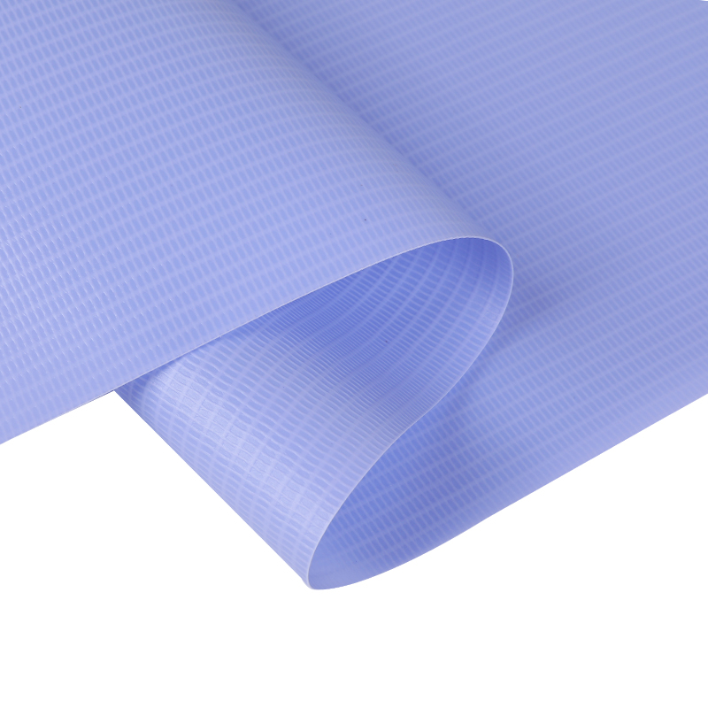
Another vital consideration when designing for backlit banners is the weight and texture of the PVC material. The thickness of the banner material can affect how light is diffused, and this, in turn, can impact the sharpness of the printed graphics. Thicker PVC materials may diffuse the light more evenly, but they can also reduce the intensity of the colors. Therefore, designers should consider the balance between material thickness and the intended design, particularly when aiming for sharp, high-definition images or text. The glossy surface of the banner helps to preserve the brightness of the printed graphics, but designers must be cautious about overloading the banner with excessive detail, as this can be hard to read or see clearly when illuminated.
The placement of the light source also plays a significant role in how well the graphics are showcased. While LED lights are commonly used for backlighting due to their energy efficiency and even distribution of light, the positioning of these lights is crucial. The ideal setup involves placing the lights evenly behind the banner to ensure consistent illumination across the entire surface. Designers should account for the possibility of light hotspots or shadows, which can occur if the lights are not uniformly placed. Proper positioning ensures that the colors and text are evenly illuminated, making the graphics more striking without any dim or overly bright areas that could detract from the overall message.
Finally, it’s important to design graphics that are not only visually appealing but also take the practical aspects of outdoor signage into account. The weather conditions, UV exposure, and temperature fluctuations that these banners are exposed to can affect their longevity and visual quality. Opting for durable inks and UV-resistant coatings will help ensure that the colors don’t fade prematurely under constant exposure to the elements. For banners that are particularly large or exposed to direct sunlight, it's also beneficial to consider how the angle of the light and the position of the viewer will affect the visibility of the graphics. Testing the banner design in different environments can help ensure that it remains impactful no matter the conditions.


